
AppCoins Wallet
Designing the three seconds after someone spends real money.
On Google Play ↗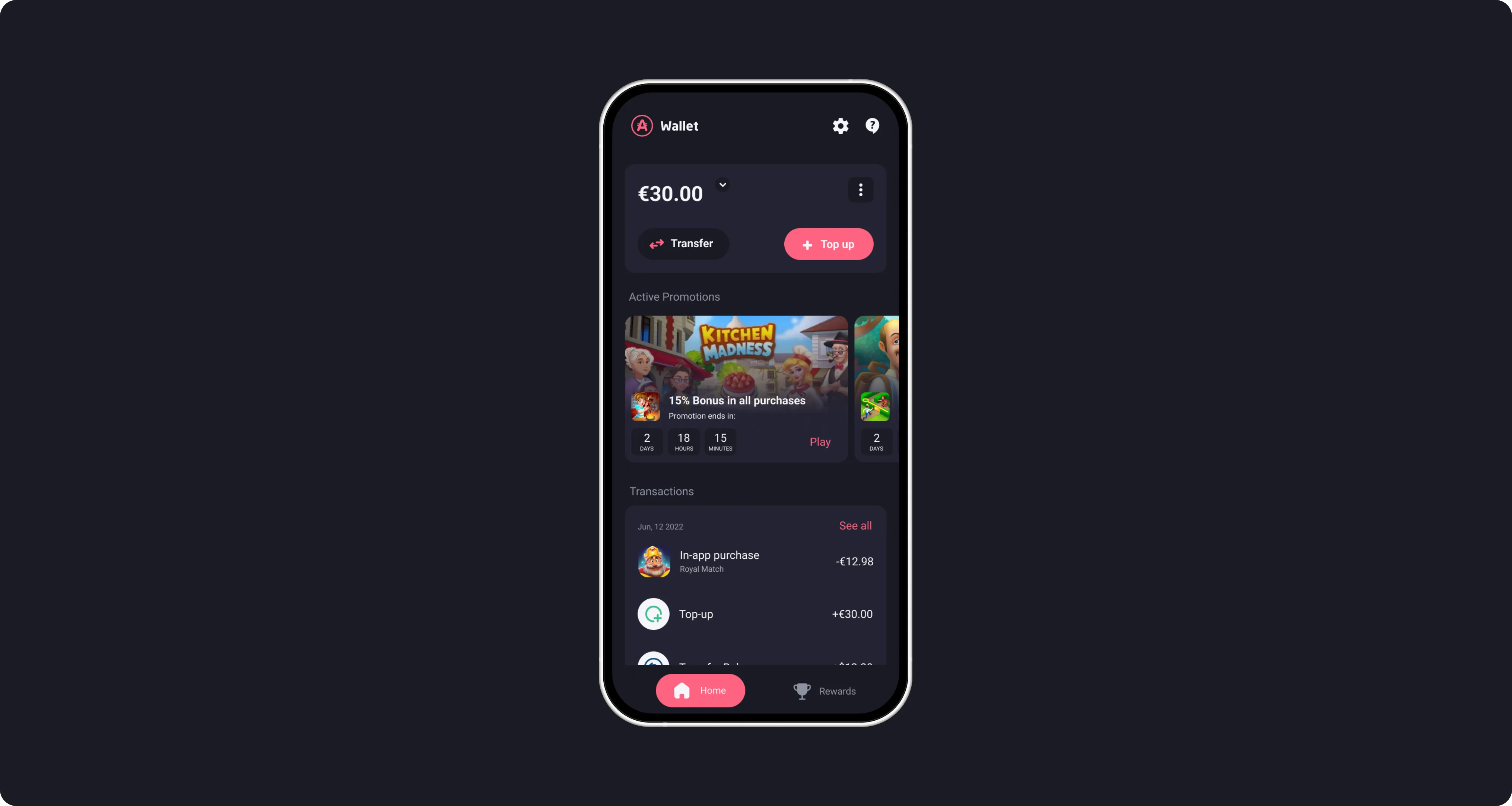
The wallet home prioritises clarity and next actions, reducing cognitive load from the first interaction.
Tap confirm. Screen loads. Did that just work?
That question — asked by a player, mid-game, seconds after spending real money — was the whole product problem. The transaction almost always went through. But the confirmation didn't show value, the reward appeared somewhere else later (or seemingly never), and the balance changed without explanation.
Unlike a B2B tool, there's no onboarding call and no second chance: a consumer who doubts one payment simply doesn't make another. The wallet ran on crypto rails, but that was irrelevant to users — what they were buying was certainty, and the interface wasn't selling it. Every ambiguous moment trained them to expect unreliability, even when everything worked.
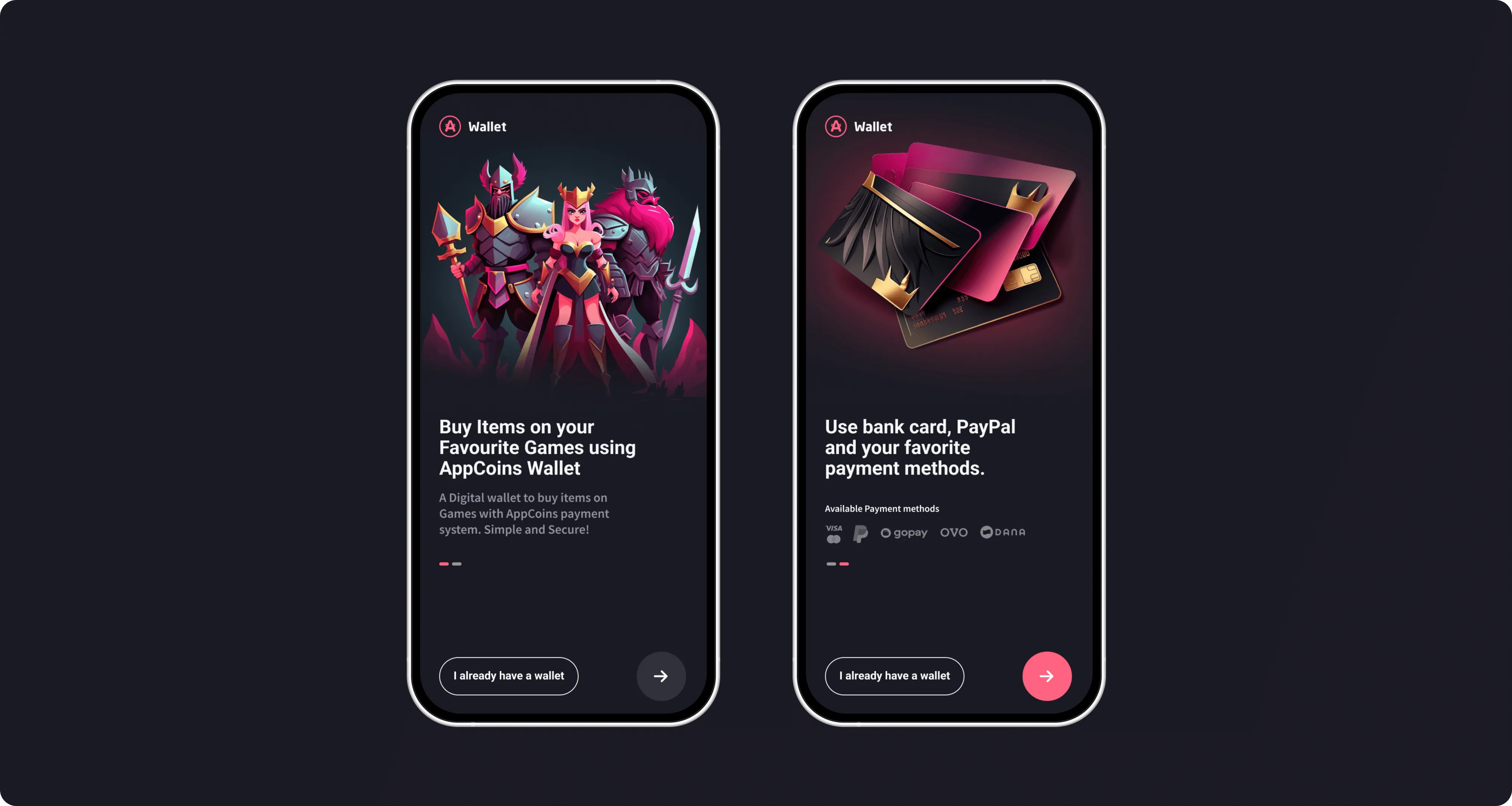
The onboarding sells what the wallet does for you. The word "blockchain" never appears.
Make the right actions obvious.
I wasn't trying to explain how the system works. I was trying to make the next step obvious and every state readable at a glance.
Blockchain terminology removed from the primary flow entirely. Users see what they paid and what they got. How it was processed is my problem, not theirs.
Every screen designed for the next action, not to document the current state. Progress drives trust faster than explanation.
Payment screens stripped to essentials: amount, bonus, confirm. Fewer choices, faster decisions, less doubt.
Loading, processing, success and failure each got distinct visuals with plain-language labels. Users stopped assuming the worst.
A shared component language across all integrated apps removed the "is this real?" moment when switching contexts.
Where trust is earned or lost.
Price, bonus, promo codes, rewards — the original experience put all of it in front of users at once and asked them to figure out the value themselves. They didn't. They hesitated. And hesitation became drop-off.
- Clear value breakdown before confirmation — price, bonus and rewards shown together, calculated by the system.
- Single primary action: one-tap purchase. Everything else moved out of the critical path.
- Rewards integrated into the payment moment, not discoverable separately afterwards.
- Post-purchase confirmation shows what you got — not just that the transaction completed.
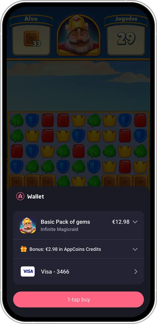
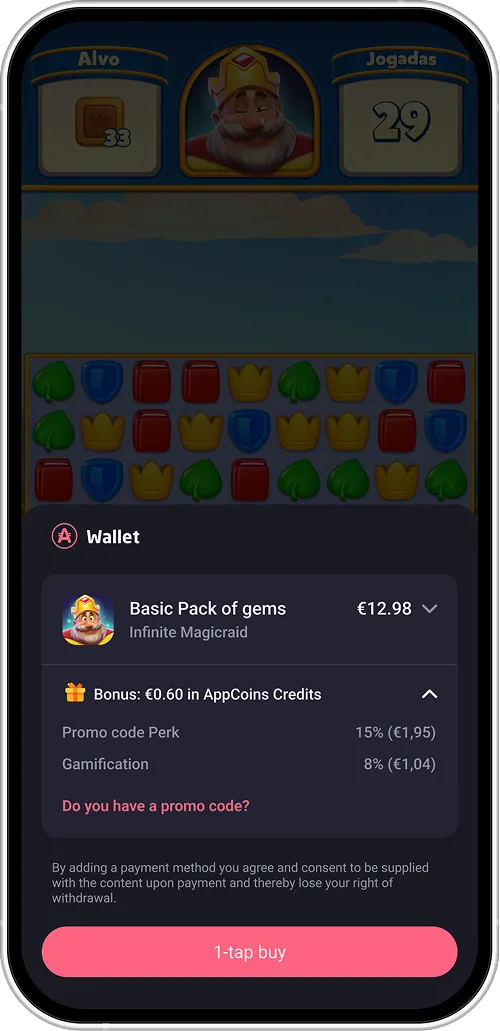
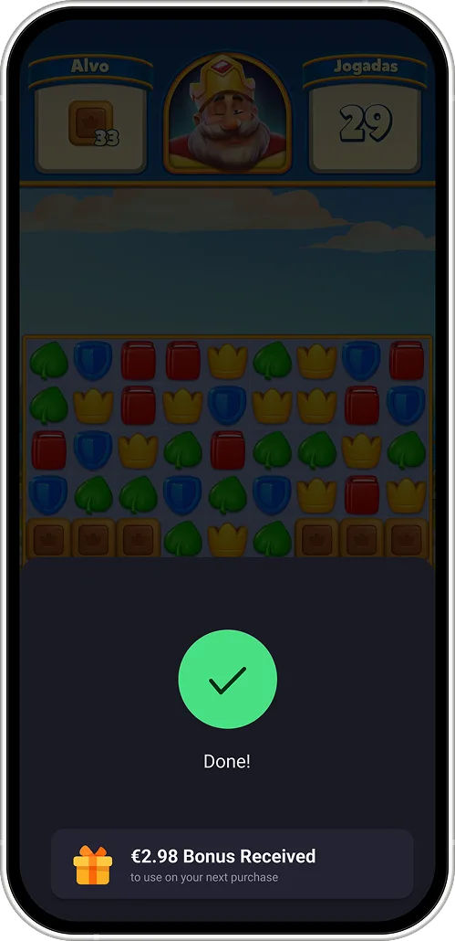
Users earned rewards with every purchase. Most didn't know.
The rewards system existed — promo codes, campaigns, referral bonuses — but it had no center of gravity. Users found rewards by accident or not at all. We redesigned rewards as a progression model: one place, visible progress, clear stakes.
- All reward entry points centralised into a single hub — one place to understand your status.
- Progression made visible: spend → unlock → grow. Users could see where they were heading.
- Urgency added to active promotions with live states and clear expiry.
- Referral elevated from a buried menu item to a first-class growth mechanic.
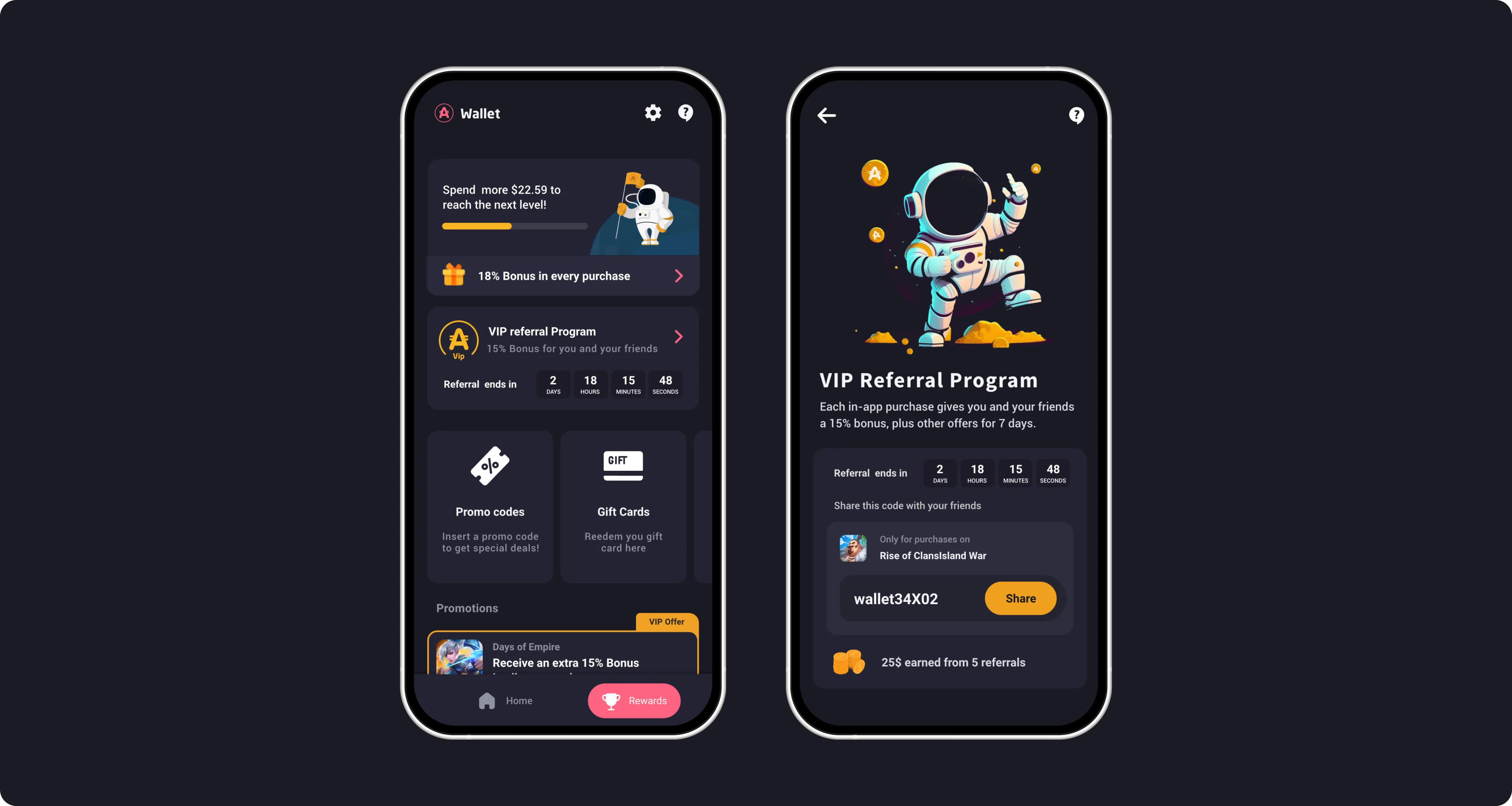
One hub, visible progress, clear stakes. People come back just to check on it.
Users don't evaluate wallets. They evaluate moments.
The purchase confirmation screen isn't just a receipt — it's where trust is earned or lost. Design for that moment, and the whole system benefits.
What this project taught me.
Users chose wallets they understood over wallets with more features. When the system communicated clearly, conversion followed.
First-time transactions had outsized influence on retention. A confident first experience set the pattern users repeated.
Stripping the flow to essentials felt like a sacrifice at the time. It wasn't. People moved faster, doubted less, came back more.