
Aptoide Connect
The system worked. Developers couldn't see it working. I fixed the second part.
Live — connect.aptoide.com ↗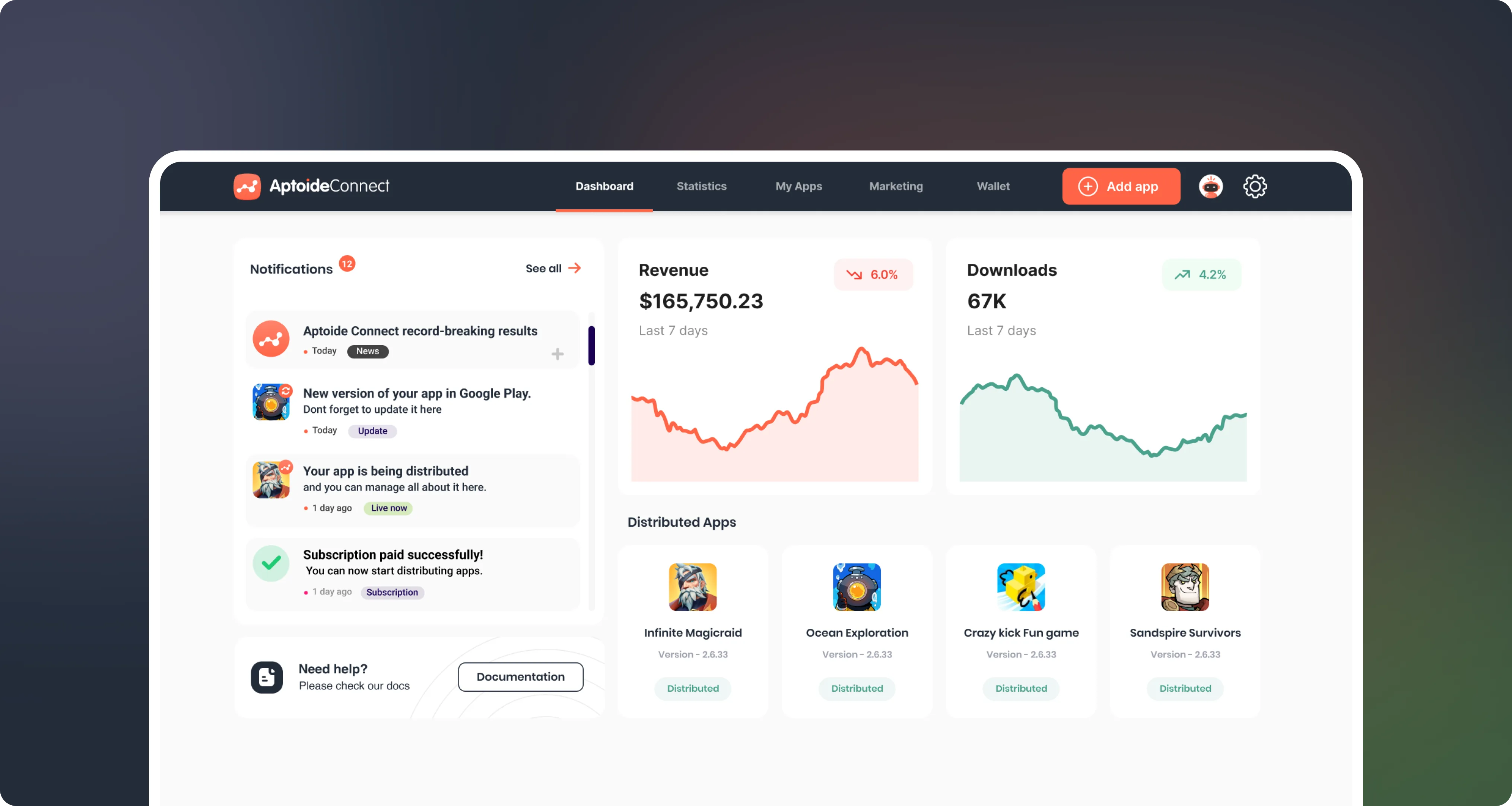
The redesigned dashboard answers one question before anything else: what's happening right now. Apps live, pending and blocked — visible at a glance.
One APK. Twenty stores. Zero visibility.
Aptoide runs a white-label store network for OEMs and regional operators. Connect is the developer layer: one APK submission reaches 20+ partner stores, each with its own approval pipeline, metadata requirements and country filters.
The economics are good: up to 90% revenue share against Google Play's 70%. Almost nobody was collecting, because the interface never showed it. Apps looked stuck when they weren't. The revenue numbers were right and nobody believed them. Most developers gave up before their first app went live.
"I submitted three weeks ago. I still don't know if it's live."
- Apps felt lost. Developers described submissions as "stuck" or "disappeared". Status labels used internal system language with no developer-facing translation.
- Analytics opened once, never again. The data was accurate. It gave no direction, no comparison, no next step.
- First submissions rarely completed. That support ticket above became the design brief.
One principle: the system should explain itself.
Every decision got the same test: does this make the system easier to read, or harder? If a screen needed a legend to be understood, it failed the test.
Ship first, configure later.
The old flow demanded full configuration before you could submit anything. We cut it down to one goal: get your first app live. Everything else moved to later, where it belongs. First submission now takes under 15 minutes.
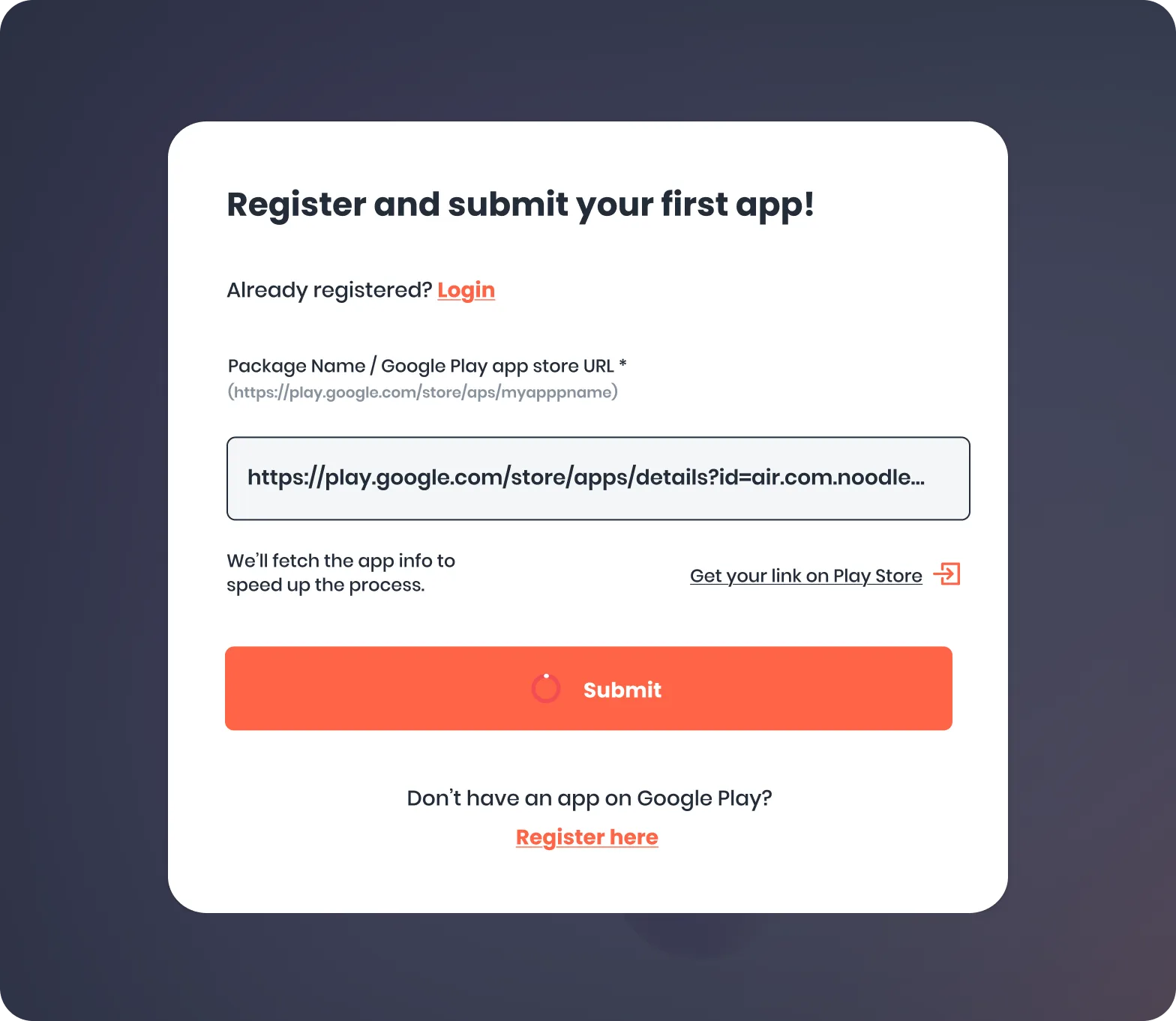
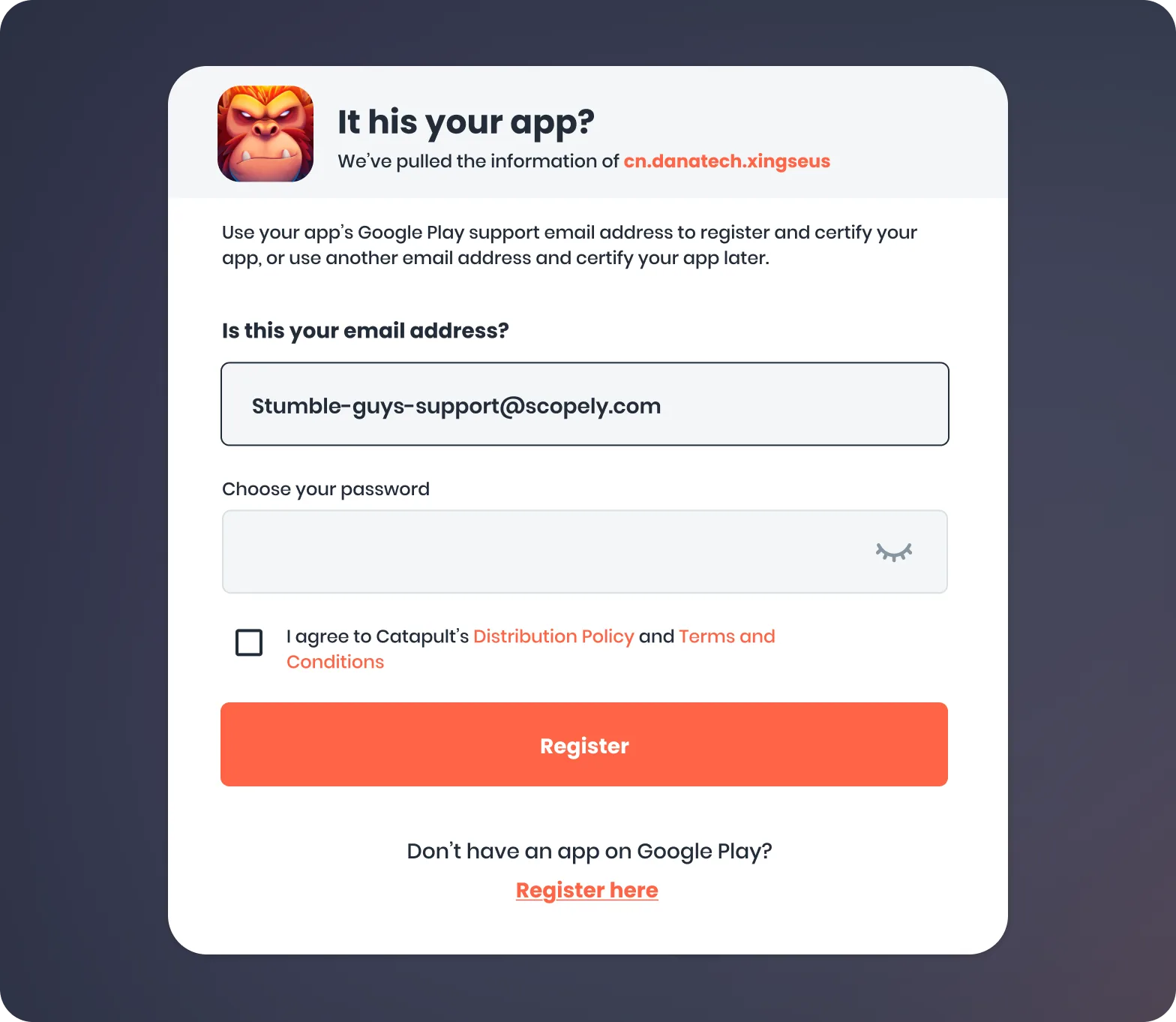
Where complexity peaks.
The old version put everything on one page. Developers either pushed through on instinct or stopped.
- Split into three scoped steps — upload, metadata, distribution targeting — each with a defined end state and inline validation.
- Store and country selection rebuilt as a visual matrix with smart defaults from prior submissions.
- Post-submission screen explicit: channels pending, channels live, estimated review timeline.
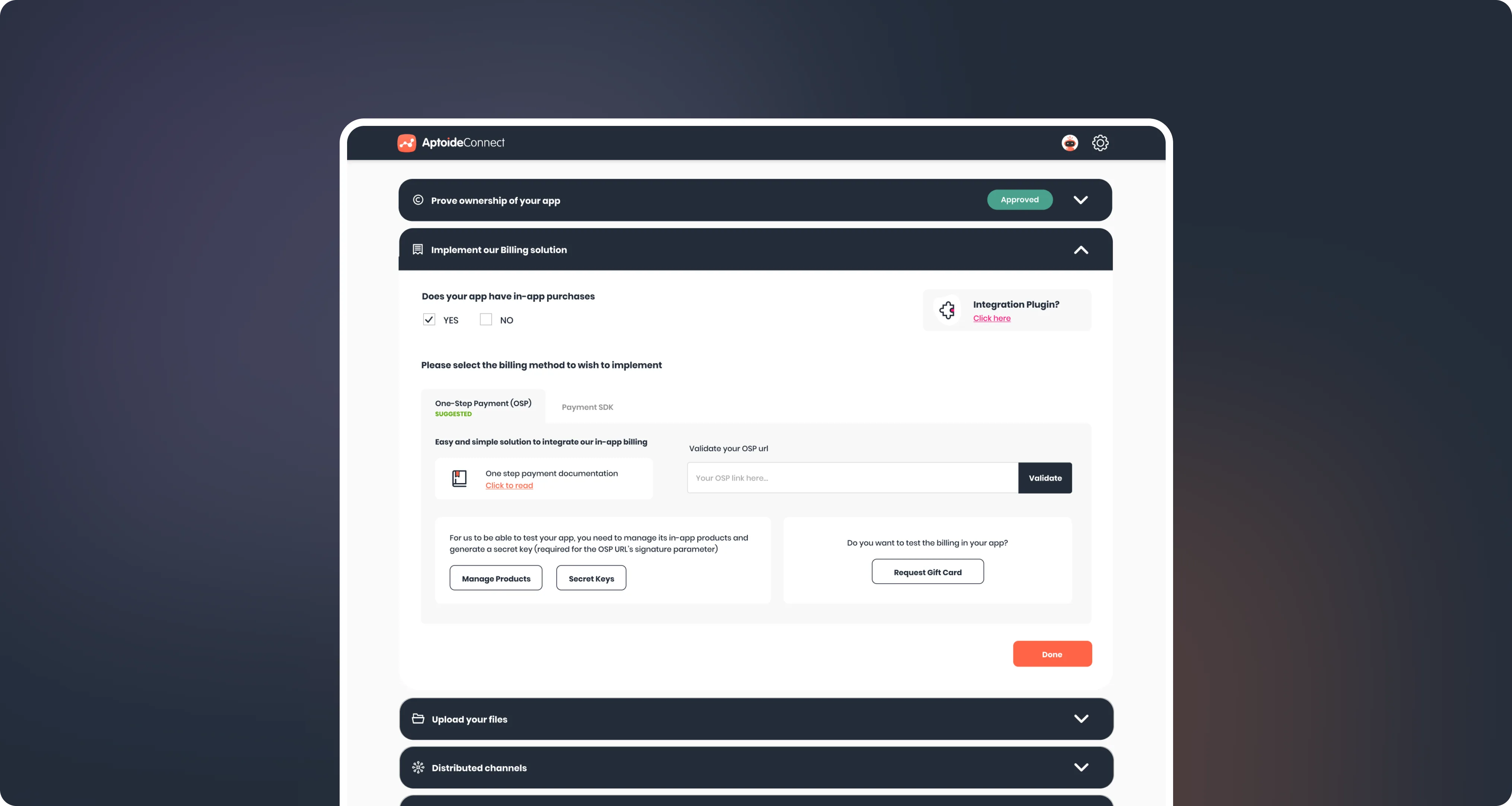
The post-submission state removes the "did it work?" uncertainty that drove most support tickets.
From status codes to decisions.
The same idea, applied to the three screens developers live in after launch.
A 40-row table of status codes became three system states — live, pending, blocked — plus a "gaps" view listing every missing channel with an actionable reason. Most coverage gains came from making existing problems visible.
Raw tables replaced with metrics tied to decisions, directional movement and auto-surfaced insights ("Downloads in Germany up 34%"). Engagement went from 20% to 60% of active users in Q1.
90% revenue share, surfaced where it matters — earnings ranges shown at distribution moments, framed as estimates, never guarantees. Enrollment up 28%, the highest since launch.
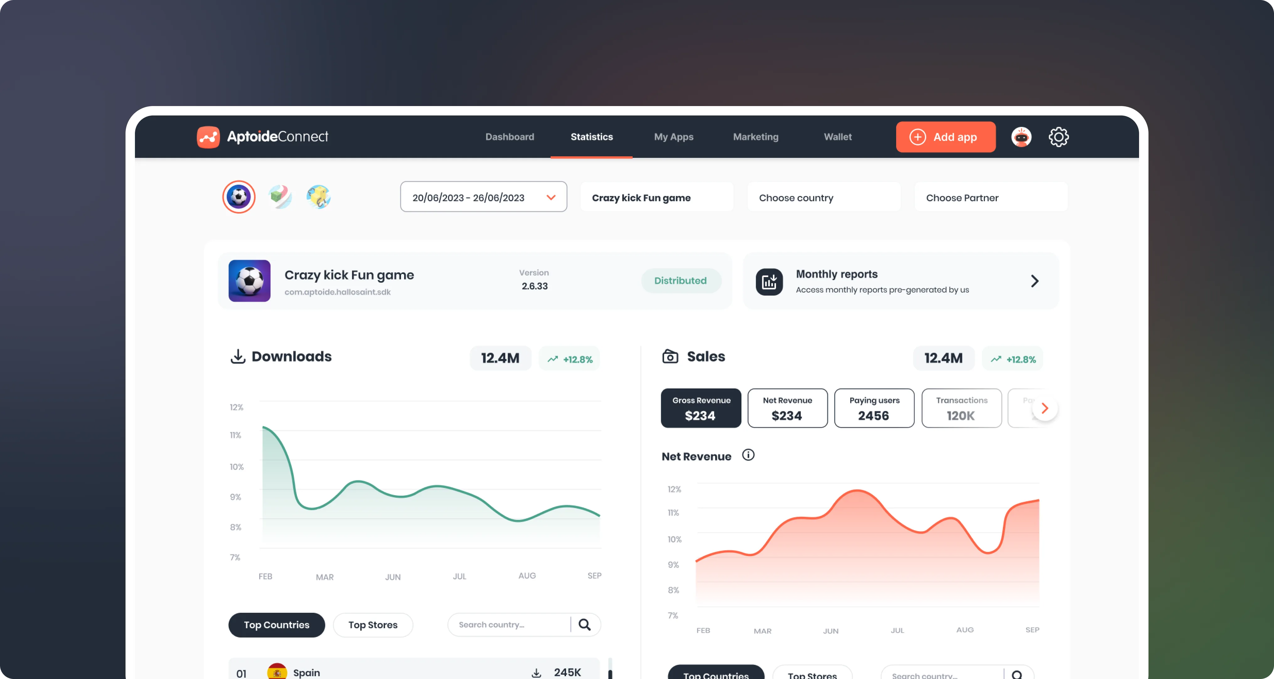
Analytics rebuilt around decisions — downloads, sales and country movement for one app, in one view.
Revenue per download vs. Google Play, sustained over 9 months.
Revenue per download through the partner store network.
Revenue growth from distribution expansion alone.
The problem wasn't distribution. It was that developers couldn't see the system working.
Six months post-launch.
What this project taught me.
Developers either accepted pre-selections blindly or changed everything. The logic behind a default is part of the design.
Once we called it a legibility problem, every decision got easier to judge.
If developers don't believe the data, they won't act on it. Credibility has to be designed in.
Final take: the platform was already capable. The best work here didn't add anything new. It made what existed feel obvious.